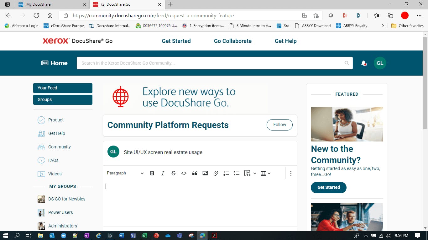
Better to show live to designers, but the screen real estate use is not optimal. I am on a laptop and as one example even filling this out this request, I only see part of this interface, I have to scroll down to get to the post button. See image inserted. The Nav on left has too much space in between items. The Groups Nav should allow for a popdown menu or similar method to I do not have to scroll. The rotating animated graphic in the center here is not needed and hogs space. The text size of this area, community platform requests with the follow button is huge and hogs space. I should be able to hide or customize the right column? Bottom line I should have an interface that presents all I need in a single laptop screen area, and feed changes in information into that space. Once I have to start scrolling it is not ideal.